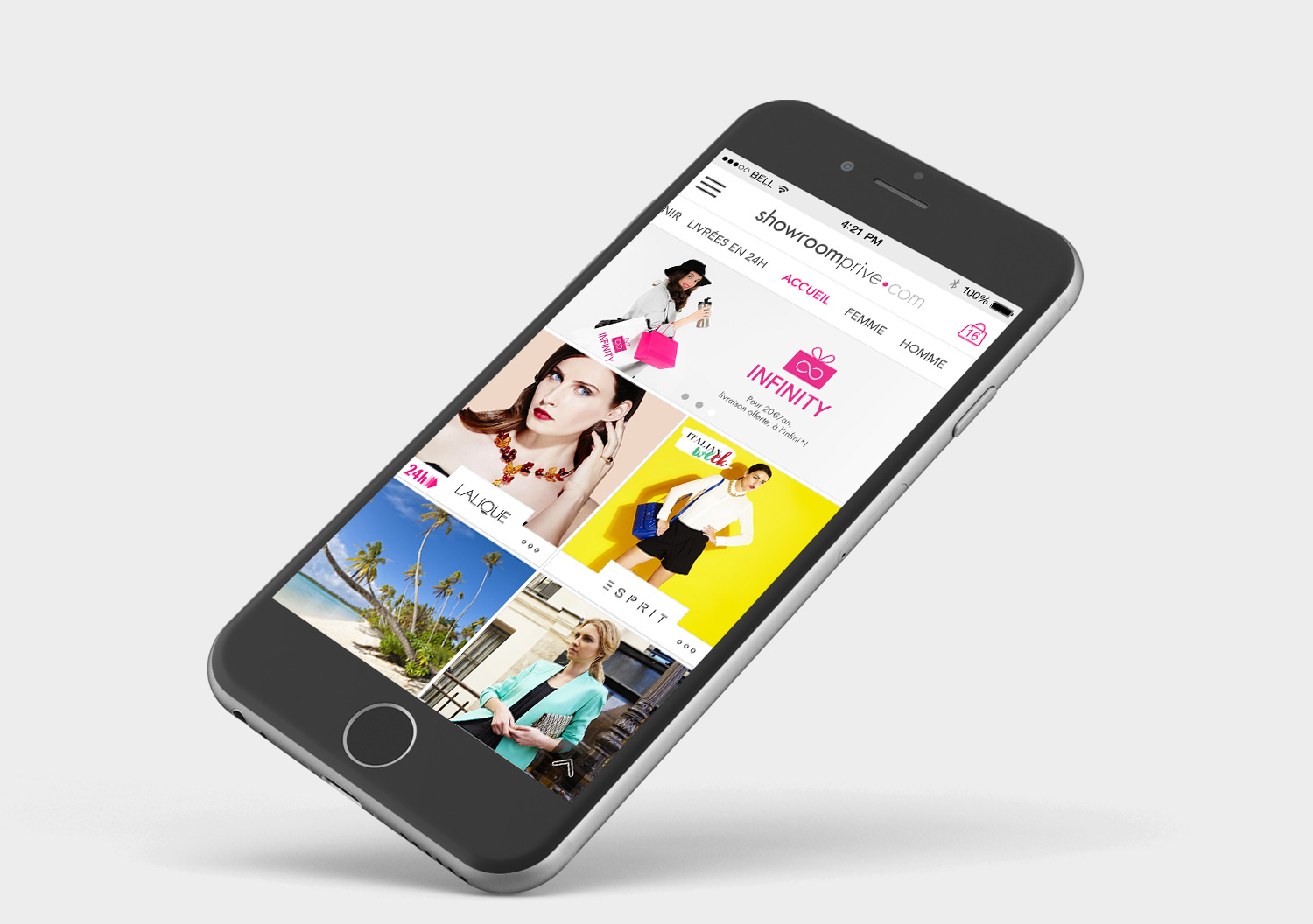
Showroomprive.com App Redesign
Company
Showroomprive.com
Year
2016
Type
UI, UX, iOS
About
Showroomprive.com is one of the most important private sales websites in France and in Europe. The sales have a limited duration and the products are up to 60% cheaper. I took part of the mobile and tablet apps redesign.
Problem
Showroomprive has changed its visual identity and wishes to decline it on its tablets and mobile applications. There are a lot of screens to deal with and the team wanted to work with our web agency to share the work.
Some parts of the user flow were no longer adapted to mobile use, so we also worked on this part with the creative director.
Goal
Make the application more intuitive and in line with the new visual identity.
Process
I worked with the UX manager of Showroomprive.com and the creative director of the agency to define our work perimeter, the number of screens to be adapted and to follow the guidelines (typography, colors...).
We took the initiative to propose screens with a more adapted UX (position and order of the elements, hierarchy of the information) to improve the user flow.
Outcome
A client really happy by our work and UX improvements done on the new app.


